Regression model for classification?
Contents
3.1. Regression model for classification?
3.1.1. What is classification?
Just as in the simple regression setting, in the simple (univariate) classification setting, we have a set of training observations \( (x_1, y_1), \dots, (x_N, y_N) \), where each \( y_n \) is a qualitative (categorical) response.
In this chapter, we will illustrate the concept of classification using the simulated Default dataset (click to explore). We are interested in predicting whether an individual will default on his or her credit card payment, which takes on the value Yes if the customer defaults on their credit card payment and No if they do not, on the basis of annual income and monthly credit card balance.
Get ready by importing the APIs needed from respective libraries.
import pandas as pd
import numpy as np
from matplotlib.gridspec import GridSpec
import matplotlib.pyplot as plt
import seaborn as sns

from sklearn.linear_model import LogisticRegression
from statsmodels.formula.api import logit

%matplotlib inline
Load the Default dataset as a pandas dataframe, convert categories (default and student) to numerical values (0 and 1), and inspect the first three rows.
data_url = "https://github.com/pykale/transparentML/raw/main/data/Default.csv"
df = pd.read_csv(data_url)

# Note: factorize() returns two objects: a label array and an array with the unique values. We are only interested in the first object.
df["default2"] = df.default.factorize()[0]
df["student2"] = df.student.factorize()[0]
df.head(3)
| default | student | balance | income | default2 | student2 | |
|---|---|---|---|---|---|---|
| 0 | No | No | 729.526495 | 44361.625074 | 0 | 0 |
| 1 | No | Yes | 817.180407 | 12106.134700 | 0 | 1 |
| 2 | No | No | 1073.549164 | 31767.138947 | 0 | 0 |
It is a good habit to inspect the data in a bit more detail before fitting a model. Let us visualise 10,000 individuals’ annual income, monthly credit card balance, and their relationships with the default status using box plot.
fig = plt.figure(figsize=(12, 5))
gs = GridSpec(1, 4)
ax1 = plt.subplot(gs[0, :-2])
ax2 = plt.subplot(gs[0, -2])
ax3 = plt.subplot(gs[0, -1])

# Take a fraction of the samples where target value (default) is 'no'
df_no = df[df.default2 == 0].sample(frac=0.15)
# Take all samples  where target value is 'yes'
df_yes = df[df.default2 == 1]
#
df_ = pd.concat((df_no, df_yes))

ax1.scatter(
    df_[df_.default == "Yes"].balance,
    df_[df_.default == "Yes"].income,
    s=40,
    c="orange",
    marker="+",
    linewidths=1,
)
ax1.scatter(
    df_[df_.default == "No"].balance,
    df_[df_.default == "No"].income,
    s=40,
    marker="o",
    linewidths=1,
    edgecolors="lightblue",
    facecolors="white",
    alpha=0.6,
)
#
ax1.set_ylim(ymin=0)
ax1.set_ylabel("Income")
ax1.set_xlim(xmin=-100)
ax1.set_xlabel("Balance")

c_palette = {"No": "lightblue", "Yes": "orange"}
sns.boxplot(data=df, y="balance", x="default", orient="v", ax=ax2, palette=c_palette)
sns.boxplot(data=df, y="income", x="default", orient="v", ax=ax3, palette=c_palette)
gs.tight_layout(plt.gcf())
# plt.show()
/tmp/ipykernel_2167/1659466026.py:39: FutureWarning:

Passing `palette` without assigning `hue` is deprecated and will be removed in v0.14.0. Assign the `x` variable to `hue` and set `legend=False` for the same effect.

  sns.boxplot(data=df, y="balance", x="default", orient="v", ax=ax2, palette=c_palette)
/tmp/ipykernel_2167/1659466026.py:40: FutureWarning:

Passing `palette` without assigning `hue` is deprecated and will be removed in v0.14.0. Assign the `x` variable to `hue` and set `legend=False` for the same effect.

  sns.boxplot(data=df, y="income", x="default", orient="v", ax=ax3, palette=c_palette)
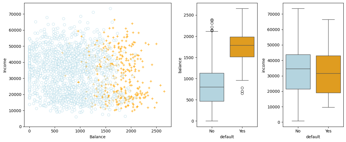
In the left-hand panel, the individuals who defaulted in a given month are shown in orange, and those who did not in blue. (The overall default rate is about 3%, so we have plotted only a fraction of the individuals who did not default.) In the centre and right-hand panels, two pairs of boxplots are shown. The first shows the distribution of balance split by the binary default variable; the second is a similar plot for income.
What can you observe from the visualisation above?
From the left-hand panel, it appears that individuals who defaulted tended to have higher credit card balances than those who did not.
From the centre and right-hand panels, it appears that individuals who defaulted tended to have higher balance than those who did not.
It is worth noting that this example displays a very pronounced relationship between the predictor balance and the response default. In most real applications, the relationship between the predictor and the response will not be nearly so strong. To illustrate the classification procedures discussed, we use this example in which the relationship between the predictor and the response is somewhat exaggerated.
Can we use linear regression to predict the probability of default?
3.1.2. Can we use linear regression for classification?
3.1.2.1. How about converting the response to a quantitative variable?
Since we can convert categorical variables (class labels) to numerical values, can we treat the classification problem as a regression problem and use linear regression to predict the class label?
Suppose there are three medical conditions of patients in an emergency room: stroke, drug overdose, and epileptic seizure. We could consider encoding these values as a quantitative response variable, \(y\), as follows:
Using this coding, least squares could be used to fit a linear regression model to predict \(y\). However, this coding implies that drug overdose is a condition in between stroke and epileptic seizure, and insisting that the difference between stroke and drug overdose is the same as the difference between drug overdose and epileptic seizure . In practice, there is no particular reason that this needs to be the case. For instance, one could choose an equally reasonable coding,
which would imply a totally different relationship among the three conditions. Each of these codings would produce fundamentally different linear models that would ultimately lead to different sets of predictions on test observations.
If the response variable’s values did take on a natural ordering, such as mild, moderate, and severe, and we felt the gap between mild and moderate was similar to the gap between moderate and severe, then a 1, 2, 3 coding would be reasonable. Even if so, unfortunately, in general there is no natural way to convert a qualitative response variable with more than two levels into a quantitative response that is ready for linear regression.
3.1.2.2. Will the binary case work?
For a binary (two level) qualitative response, the situation is better. For example, perhaps there are only two possibilities for the patient’s medical condition: stroke and drug overdose. We could then code the response as
follows:
We could then fit a linear regression to this binary response, and predict drug overdose if \( y > 0.5 \) and stroke otherwise. In the binary case, it is not hard to show that even if we flip the above coding, linear regression will produce the same final predictions.
Now let us compare the difference between the linear regression model and the logistic regression model for a binary classification task on the Default dataset.
X_train = df.balance.values.reshape(-1, 1)
y = df.default2

# Create array of test data. Calculate the classification probability and predicted classification.
X_test = np.arange(df.balance.min(), df.balance.max()).reshape(-1, 1)

clf = LogisticRegression(solver="newton-cg")
clf.fit(X_train, y)
prob = clf.predict_proba(X_test)

fig, (ax1, ax2) = plt.subplots(1, 2, figsize=(12, 5))
# Left plot
sns.regplot(
    x=df.balance,
    y=df.default2,
    order=1,
    ci=None,
    scatter_kws={"color": "orange"},
    line_kws={"color": "lightblue", "lw": 2},
    ax=ax1,
)
# Right plot
ax2.scatter(X_train, y, color="orange")
ax2.plot(X_test, prob[:, 1], color="lightblue")

for ax in fig.axes:
    ax.hlines(
        1,
        xmin=ax.xaxis.get_data_interval()[0],
        xmax=ax.xaxis.get_data_interval()[1],
        linestyles="dashed",
        lw=1,
    )
    ax.hlines(
        0,
        xmin=ax.xaxis.get_data_interval()[0],
        xmax=ax.xaxis.get_data_interval()[1],
        linestyles="dashed",
        lw=1,
    )
    ax.set_ylabel("Probability of default")
    ax.set_xlabel("Balance")
    ax.set_yticks([0, 0.25, 0.5, 0.75, 1.0])
    ax.set_xlim(xmin=-100)
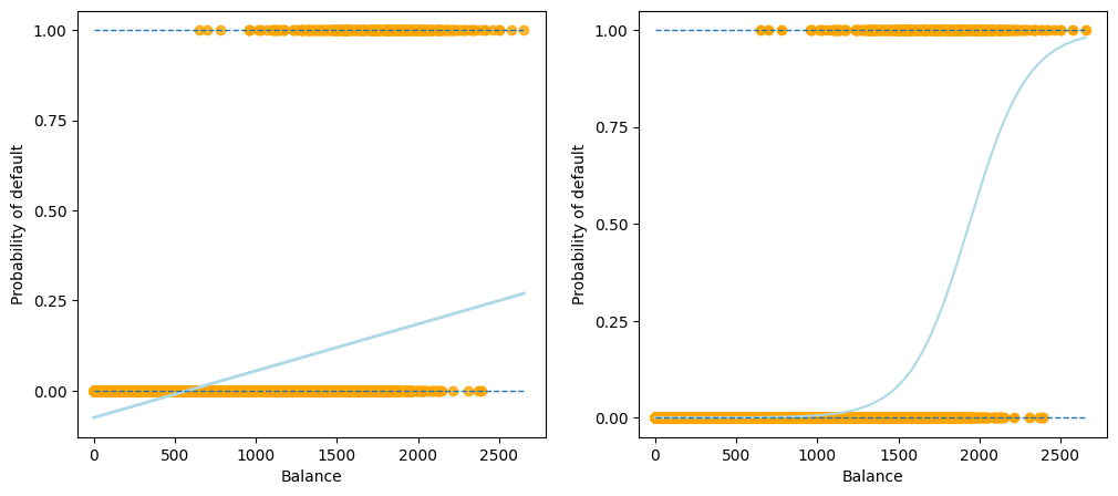
As shown in the output figure above, for a binary response with a 0/1 coding, although the linear regression model can also produce an estimate of \(\mathbb{P}(y|x)\), some estimates might be outside the \([0, 1]\) interval, making them hard to be interpreted as probabilities. Since the predicted outcome of linear regression is not a probability, but a linear interpolation between points, there is no meaningful threshold at which you can distinguish one class from the other.
An additional illustration of this issue is available on Stackoverflow.
3.1.2.3. Reasons not to perform classification using a regression method
There are two main reasons not to perform classification using a regression method:
Label coding: Difficulty in coding the response variable with more than two classes;
Interpretation: Difficulty in interpreting the predicted outcome of linear regression as a probability and thus in choosing a threshold to distinguish one class from the other.
3.1.3. Exercise
1. All the following exercises involve the use of the Weekly dataset.
Load the dataset, convert the Direction categories to numerical values, and inspect the first \(10\) rows.
# Write your code below to answer the question
Compare your answer with the reference solution below
import pandas as pd

data_url = "https://github.com/pykale/transparentML/raw/main/data/Weekly.csv"
df = pd.read_csv(data_url)
df["Direction1"] = df.Direction.factorize()[0]
df.head(10)
| Year | Lag1 | Lag2 | Lag3 | Lag4 | Lag5 | Volume | Today | Direction | Direction1 | |
|---|---|---|---|---|---|---|---|---|---|---|
| 0 | 1990 | 0.816 | 1.572 | -3.936 | -0.229 | -3.484 | 0.154976 | -0.270 | Down | 0 |
| 1 | 1990 | -0.270 | 0.816 | 1.572 | -3.936 | -0.229 | 0.148574 | -2.576 | Down | 0 |
| 2 | 1990 | -2.576 | -0.270 | 0.816 | 1.572 | -3.936 | 0.159837 | 3.514 | Up | 1 |
| 3 | 1990 | 3.514 | -2.576 | -0.270 | 0.816 | 1.572 | 0.161630 | 0.712 | Up | 1 |
| 4 | 1990 | 0.712 | 3.514 | -2.576 | -0.270 | 0.816 | 0.153728 | 1.178 | Up | 1 |
| 5 | 1990 | 1.178 | 0.712 | 3.514 | -2.576 | -0.270 | 0.154444 | -1.372 | Down | 0 |
| 6 | 1990 | -1.372 | 1.178 | 0.712 | 3.514 | -2.576 | 0.151722 | 0.807 | Up | 1 |
| 7 | 1990 | 0.807 | -1.372 | 1.178 | 0.712 | 3.514 | 0.132310 | 0.041 | Up | 1 |
| 8 | 1990 | 0.041 | 0.807 | -1.372 | 1.178 | 0.712 | 0.143972 | 1.253 | Up | 1 |
| 9 | 1990 | 1.253 | 0.041 | 0.807 | -1.372 | 1.178 | 0.133635 | -2.678 | Down | 0 |
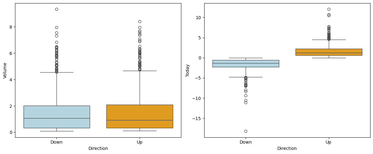
2. Visualise the relationships between Volume and Today with the Direction using a box plot. Hint: See section 3.1.1.
# Write your code below to answer the question
Compare your answer with the reference solution below
import matplotlib.pyplot as plt
from matplotlib.gridspec import GridSpec
import seaborn as sns

fig = plt.figure(figsize=(12, 5))
gs = GridSpec(1, 2)
ax2 = plt.subplot(gs[0, -2])
ax3 = plt.subplot(gs[0, -1])


c_palette = {"Down": "lightblue", "Up": "orange"}
sns.boxplot(data=df, y="Volume", x="Direction", orient="v", ax=ax2, palette=c_palette)
sns.boxplot(data=df, y="Today", x="Direction", orient="v", ax=ax3, palette=c_palette)
gs.tight_layout(plt.gcf())

# From the left-hand panel, it appears that it is very tough to predict the dicrection from the volume
# as the mean value of Volume for both's classes of the direction is almost same.
# From the right-hand panels, it appears that positive today's value indicate the up direction and negative value indicate down.
/tmp/ipykernel_2167/3770042660.py:12: FutureWarning:

Passing `palette` without assigning `hue` is deprecated and will be removed in v0.14.0. Assign the `x` variable to `hue` and set `legend=False` for the same effect.

  sns.boxplot(data=df, y="Volume", x="Direction", orient="v", ax=ax2, palette=c_palette)
/tmp/ipykernel_2167/3770042660.py:13: FutureWarning:

Passing `palette` without assigning `hue` is deprecated and will be removed in v0.14.0. Assign the `x` variable to `hue` and set `legend=False` for the same effect.

  sns.boxplot(data=df, y="Today", x="Direction", orient="v", ax=ax3, palette=c_palette)
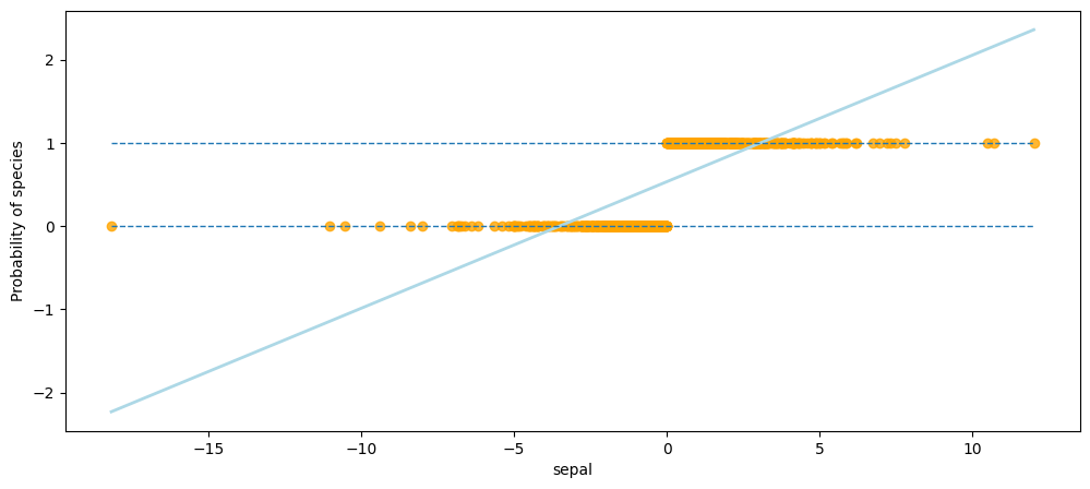
3. Use a linear regression model for binary classification on the Weekly dataset and explain why you should not perform classification using a regression method. Hint: See section 3.1.2.2.
# Write your code below to answer the question
Compare your answer with the reference solution below
import numpy as np

fig, ax1 = plt.subplots(1, 1, figsize=(12, 5))

sns.regplot(
    x=df.Today,
    y=df.Direction1,
    order=1,
    ci=None,
    scatter_kws={"color": "orange"},
    line_kws={"color": "lightblue", "lw": 2},
    ax=ax1,
)

ax1.hlines(
    1,
    xmin=ax1.xaxis.get_data_interval()[0],
    xmax=ax1.xaxis.get_data_interval()[1],
    linestyles="dashed",
    lw=1,
)
ax1.hlines(
    0,
    xmin=ax1.xaxis.get_data_interval()[0],
    xmax=ax1.xaxis.get_data_interval()[1],
    linestyles="dashed",
    lw=1,
)
ax1.set_ylabel("Probability of species")
ax1.set_xlabel("sepal")

# As shown in the output of this cell, for a binary response with a 0/1 coding, although the linear regression model can also
# produce an estimate of P(y|x), some estimates might be outside the [0, 1] interval, making them hard to be interpreted as probabilities.
# Since the predicted outcome of linear regression is not a probability, but a linear interpolation between points,
# there is no meaningful threshold at which you can distinguish one class from the other.
# Thats why you should not perform classification using a regression method.
Text(0.5, 0, 'sepal')