Graphics
Contents
Graphics
Read then Launch
This content is best viewed in html because jupyter notebook cannot display some content (e.g. figures, equations) properly. You should finish reading this page first and then launch it as an interactive notebook in Google Colab (faster, Google account needed) or Binder by clicking the rocket symbol () at the top.
Plotting figures using matplotlib and seaborn
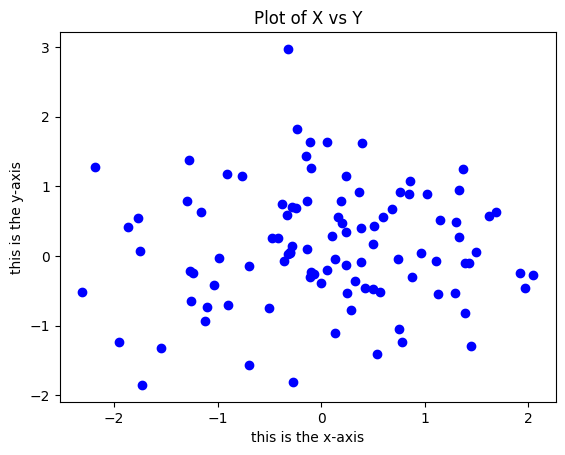
In python, matplotlib is the most used library for plot. matplotlib.pyplot is a collection of command style functions that make matplotlib work like MATLAB (a popular programming language). The pyplot.plot() function is used to plot lines, and the pyplot.scatter() function is used to plot points. The pyplot.plot() and pyplot.scatter() functions will generate an output figure object, which can be displayed by the pyplot.show() function. In addition, the pyplot.savefig() function can be used to save the figure object to a file.
import numpy as np
from matplotlib import pyplot as plt

%matplotlib inline

x = np.random.normal(0, 1, 100)
y = np.random.normal(0, 1, 100)

plt.scatter(x, y, c="b")  # please use plt.plot? to look at more options
plt.ylabel("this is the y-axis")
plt.xlabel("this is the x-axis")
plt.title("Plot of X vs Y")
plt.savefig("Figure.pdf")  # use plt.savefig function to save images
plt.show()
Use plt.scatter? and plt.plot? to see the documentation of these functions.
Next, we will create a more sophisticated plot using the pyplot.contour() function. The pyplot.contour() function can be used to plot contour lines of a function. The pyplot.contour() function takes three arguments: x, y, and z. x and y are 1D arrays of x and y coordinates of the grid points, and z is a 2D array of z coordinates of the grid points. The pyplot.contour() function returns a ContourSet object, which can be used to add labels to the contour lines.
First, let us create the data needed for the contour plot.
# in order to use Pi, math module needs to loaded first
import math

x = np.linspace(-math.pi, math.pi, num=50)
print(x)
[-3.14159265 -3.01336438 -2.88513611 -2.75690784 -2.62867957 -2.5004513
 -2.37222302 -2.24399475 -2.11576648 -1.98753821 -1.85930994 -1.73108167
 -1.60285339 -1.47462512 -1.34639685 -1.21816858 -1.08994031 -0.96171204
 -0.83348377 -0.70525549 -0.57702722 -0.44879895 -0.32057068 -0.19234241
 -0.06411414  0.06411414  0.19234241  0.32057068  0.44879895  0.57702722
  0.70525549  0.83348377  0.96171204  1.08994031  1.21816858  1.34639685
  1.47462512  1.60285339  1.73108167  1.85930994  1.98753821  2.11576648
  2.24399475  2.37222302  2.5004513   2.62867957  2.75690784  2.88513611
  3.01336438  3.14159265]
Use numpy.meshgrid() to create a rectangular grid out of an array of x values and an array of y values.
import matplotlib.cm as cm
import matplotlib.mlab as mlab

y = x
X, Y = np.meshgrid(x, y)
%whos is a magic function that lists all the variables in the current workspace.
%whos
Variable   Type       Data/Info
-------------------------------
X          ndarray    50x50: 2500 elems, type `float64`, 20000 bytes
Y          ndarray    50x50: 2500 elems, type `float64`, 20000 bytes
cm         module     <module 'matplotlib.cm' f<...>ckages/matplotlib/cm.py'>
math       module     <module 'math' from '/opt<...>-38-x86_64-linux-gnu.so'>
mlab       module     <module 'matplotlib.mlab'<...>ages/matplotlib/mlab.py'>
np         module     <module 'numpy' from '/op<...>kages/numpy/__init__.py'>
plt        module     <module 'matplotlib.pyplo<...>es/matplotlib/pyplot.py'>
x          ndarray    50: 50 elems, type `float64`, 400 bytes
y          ndarray    50: 50 elems, type `float64`, 400 bytes
Use plt.contour() to plot contour lines.
# same as above,
f = np.cos(Y) / (1 + np.square(X))
CS = plt.contour(X, Y, f)
plt.show()
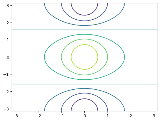
f.shape
(50, 50)
Similarly, use plt.contour? to see the documentation of the pyplot.contour() function.
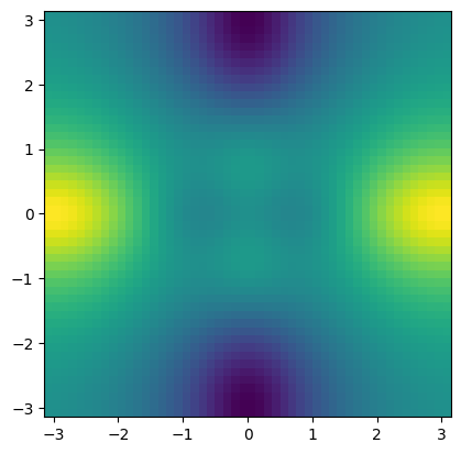
2D arrays can also be visualised by the imshow() function, which produces colour-coded plot.
fa = (f - f.T) / 2  # f.T for transpose or tranpose(f)
plt.imshow(fa, extent=(x[0], x[-1], y[0], y[-1]))
plt.show()
This figure is also known as heatmap. In Python, there is another package called seaborn that can be used to create heatmap.
import seaborn as sns

sns.heatmap(f)
plt.show()
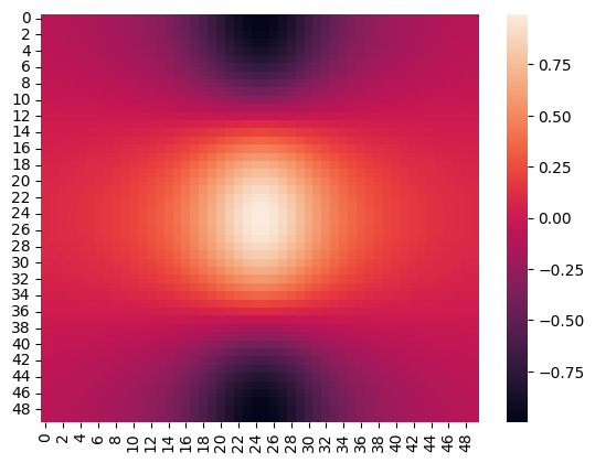
For more information, please use sns.heatmap? to see the documentation of the sns.heatmap() function.
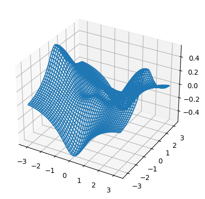
The following example produces a 3D plot.
from mpl_toolkits.mplot3d import axes3d

fig = plt.figure()
ax = fig.add_subplot(111, projection="3d")
ax.plot_wireframe(X, Y, fa)
plt.show()
Exercises
1. Create \(20\) equally spaced data between \(45\) and \(130\) as \(x\) and \(20\) equally spaced data between \(10\) and \(85\) as \(y\).
# Write your code below to answer the question
Compare your answer with the reference solution below
import math
import numpy as np

x = np.linspace(45, 130, num=20)
y = np.linspace(10, 85, num=20)
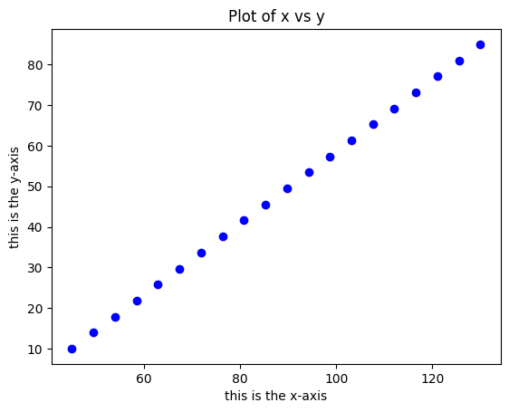
2. Visualise the data from Exercise 1 above into a 2-dimensional space with proper labels.
# Write your code below to answer the question
Compare your answer with the reference solution below
from matplotlib import pyplot as plt

plt.scatter(x, y, c="b")
plt.ylabel("this is the y-axis")
plt.xlabel("this is the x-axis")
plt.title("Plot of x vs y")
plt.show()
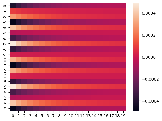
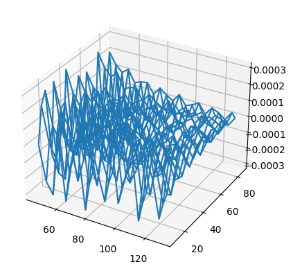
3. Use the data from Exercise 1 above to plot a heatmap and a 3-dimensional projection.
# Write your code below to answer the question
Compare your answer with the reference solution below
import seaborn as sns
from mpl_toolkits.mplot3d import axes3d

X, Y = np.meshgrid(x, y)
f = np.cos(Y) / (1 + np.square(X))
sns.heatmap(f)
plt.show()


fig = plt.figure()
ax = fig.add_subplot(111, projection="3d")
fa = (f - f.T) / 2
ax.plot_wireframe(X, Y, fa)
plt.show()