
Classification
KaleCancer Example: Clinical covariates and WSI to predict cancer staging
You have a clinical table and a folder of pathology slide features.
In this tutorial, we will answer three questions:
Can these data predict cancer stage?
Does combining them beat using either one alone?
What is the model actually looking at?
The cohort is synthetic. We created the signal ourselves, so we can check that KaleCancer finds it. The results are purely illustrative.
import warnings
import numpy as np
import pandas as pd
import torch
import matplotlib.pyplot as plt
from IPython.display import display

from synthetic_showcase_data import make_showcase_cohort, PATCH_SIZE

RANDOM_STATE = 0

warnings.filterwarnings('ignore', message='IProgress not found')
EARLY, LATE, MODEL = '#2a78d6', '#eb6834', '#1baf7a'
plt.style.use('default')  # Light plots even when the editor uses a dark theme.
plt.rcParams.update({'axes.spines.top': False, 'axes.spines.right': False})
1 Load Your Data
data_folder = '../../../data/synthetic_showcase'
make_showcase_cohort(data_folder)

table = pd.read_csv(data_folder + '/clinical.csv', index_col=0)
display(table.head())
| age | gender | stage | |
|---|---|---|---|
| patient_id | |||
| patient_000 | 63.047171 | M | late |
| patient_001 | 49.600159 | F | early |
| patient_002 | 67.504512 | F | late |
| patient_003 | 69.405647 | F | late |
| patient_004 | 40.489648 | F | early |
Wrap each source in a modality, and KaleCancer joins them by patient id. required_modalities=[] keeps all patients.
from kalecancer.loaddata import Tabular, PatchFeatures, Classification, MultimodalDataset

clinical = Tabular(table.drop(columns=['stage']))
slides = PatchFeatures.from_glob(data_folder + '/patches/*.h5', id_pattern=r'(patient_\d{3})\.h5')
target = Classification(labels=table['stage'], classes=['early', 'late'])

dataset = MultimodalDataset(
    modalities={'clinical': clinical, 'slides': slides},
    target=target,
    required_modalities=[]
)
display(dataset.summary())
| count | |
|---|---|
| available: clinical | 200 |
| available: slides | 180 |
| available: target | 200 |
| included | 200 |
| included with clinical | 200 |
| included with slides | 180 |
| label: early | 85 |
| label: late | 115 |
Visualising the data
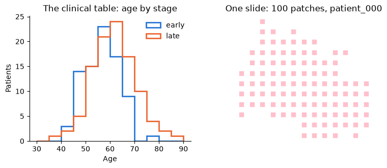
Patches each containing a coordinate pointing to the location of the WSI they encode.
fig, (left, right) = plt.subplots(1, 2, figsize=(9, 3.2))

for stage, colour in [('early', EARLY), ('late', LATE)]:
    left.hist(table.loc[table['stage'] == stage, 'age'], bins=range(30, 95, 5), histtype='step', linewidth=2, color=colour, label=stage)
left.set(title='The clinical table: age by stage', xlabel='Age', ylabel='Patients')
left.legend(frameon=False)

patient = slides.ids[0]
patches = slides.instances(patient)
right.scatter(patches['x'], patches['y'], marker='s', s=26, color='pink')
right.set_title(f'One slide: {len(patches)} patches, {patient}')
right.set_aspect('equal')
right.invert_yaxis()
right.axis('off')
plt.show()
2 Build a Model
For Intermediate Fusion: each modality gets an encoder, a fusion method combines them, and a head makes the prediction. Any torch.nn.Module can be an encoder.
ABMIL pools a slide’s patches with attention. MaskedMean averages whichever modalities a patient has, so a patient with no slide still gets a prediction.
from kalecancer.model import ABMIL, MLP, IntermediateFusion, MaskedMean, ClassificationHead

# Needed to ensure model weights are initialised consistently
torch.manual_seed(RANDOM_STATE)

clinical_encoder = MLP(in_dim=2, hidden_dims=[16], out_dim=16, dropout=0.25)
slide_encoder = ABMIL(in_dim=32, hidden_dim=16, attention_dim=8, dropout=0.25)
head = ClassificationHead(in_dim=16, n_classes=2)

model = IntermediateFusion(
    encoders={'clinical': [clinical_encoder], 'slides': [slide_encoder]},
    fusion=MaskedMean(),
    head=head
)
3 Train
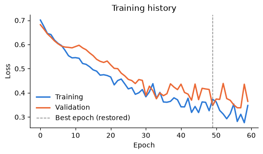
Pipeline works like a scikit-learn estimator. It fits the transforms on the training patients only, so nothing leaks from the test set. It also holds back validation patients and stops when their AUROC stops improving, then restores the best epoch.
from functools import partial
from sklearn.impute import SimpleImputer
from sklearn.model_selection import StratifiedShuffleSplit
from sklearn.preprocessing import OrdinalEncoder, StandardScaler
from kalecancer.evaluate import AUROC
from kalecancer.pipeline import EarlyStopping, Pipeline
from kalecancer.prepdata import ColumnGroup, TableTransform

auroc = AUROC(positive_class='late')

clinical_transform = TableTransform(
    groups={
        'numeric': ColumnGroup(['age'], [SimpleImputer(), StandardScaler()]),
        'categorical': ColumnGroup(['gender'], [OrdinalEncoder(encoded_missing_value=-1)])
    },
    drop=[]
)

pipeline = Pipeline(
    model=model,
    transforms={'clinical': clinical_transform},
    optimizer=partial(torch.optim.AdamW, lr=3e-3),
    batch_size=16,
    drop_last=False,
    max_epochs=60,
    validation=StratifiedShuffleSplit(n_splits=1, test_size=0.2, random_state=RANDOM_STATE),
    early_stopping=EarlyStopping(metric=auroc, patience=15, restore_best=True),
    accelerator='cpu',
    precision='32-true',
    random_state=RANDOM_STATE
)
from kalecancer.loaddata import train_test_split

train, test = train_test_split(dataset, test_size=0.25, stratify=True, random_state=RANDOM_STATE)

pipeline.fit(train)
pipeline.fit_report_
{'n_train': 120,
 'n_val': 30,
 'label: early': 51,
 'label: late': 69,
 'epochs_run': 60,
 'best_epoch': 49,
 'best_score': 0.9457013607025146,
 'optimizer_steps': 480,
 'skipped_batches': 0,
 'non_finite_inputs': {}}
fig, ax = plt.subplots(figsize=(6, 3))
ax.plot(pipeline.history_['train_loss'], color=EARLY, linewidth=2, label='Training')
ax.plot(pipeline.history_['val_loss'], color=LATE, linewidth=2, label='Validation')
ax.axvline(pipeline.fit_report_['best_epoch'], color='grey', linestyle='--', linewidth=1, label='Best epoch (restored)')
ax.set(title='Training history', xlabel='Epoch', ylabel='Loss')
ax.legend(frameon=False)
plt.show()
4 Evaluate
All patients get a prediction, even those that don’t have any patches.
predictions = pipeline.predict(test)

no_slide = test.present.index[~test.present['slides']]
print(f'{len(no_slide)} of the {len(test)} test patients have no slide. Their predictions:')
display(predictions.loc[no_slide[:]])
6 of the 50 test patients have no slide. Their predictions:
| probability[early] | probability[late] | |
|---|---|---|
| id | ||
| patient_006 | 0.599422 | 0.400578 |
| patient_056 | 0.694390 | 0.305610 |
| patient_123 | 0.040419 | 0.959581 |
| patient_128 | 0.881362 | 0.118638 |
| patient_145 | 0.839604 | 0.160396 |
| patient_176 | 0.024949 | 0.975052 |
from kalecancer.evaluate import BalancedAccuracy

metrics = {'auroc': auroc, 'balanced_accuracy': BalancedAccuracy()}

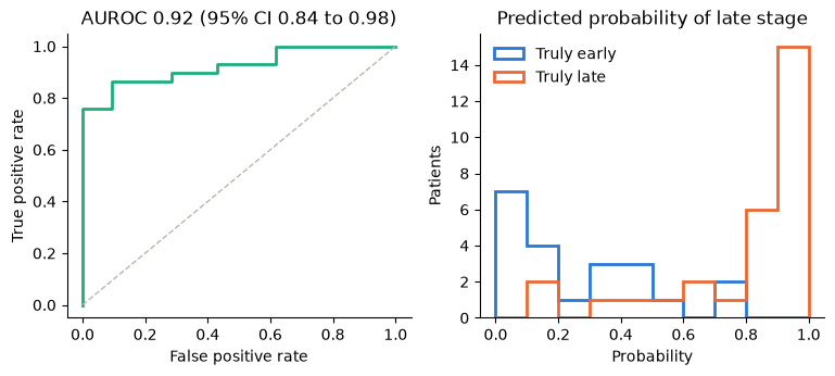
pipeline.evaluate(test, metrics)
auroc                0.922824
balanced_accuracy    0.859606
Name: score, dtype: float64
Evaluating on the training cohort is data leakage. KaleCancer guards against this behaviour.
try:
    pipeline.evaluate(train, metrics)
except ValueError as error:
    print(error)
150 patients were used to fit this pipeline (e.g. ['patient_001', 'patient_002', 'patient_004', 'patient_005', 'patient_007']); evaluate on held-out patients, or pass allow_seen=True
bootstrap_ci allows us to calculate confidence intervals instead of a single metric value.
from sklearn.metrics import roc_curve
from kalecancer.evaluate import EvalContext, bootstrap_ci

truth = test.target.frame.loc[predictions.index, 'label']
context = EvalContext(train_target=pipeline.train_target_, classes=['early', 'late'])
interval = bootstrap_ci(auroc, predictions, test.target.frame.loc[predictions.index], context)

fig, (left, right) = plt.subplots(1, 2, figsize=(9, 3.4))

false_positive, true_positive, _ = roc_curve(truth == 'late', predictions['probability[late]'])
left.plot(false_positive, true_positive, color=MODEL, linewidth=2)
left.plot([0, 1], [0, 1], color='#b8b6ae', linestyle='--', linewidth=1)
left.set(title=f'AUROC {interval.estimate:.2f} (95% CI {interval.lower:.2f} to {interval.upper:.2f})',
         xlabel='False positive rate', ylabel='True positive rate')

bins = np.linspace(0, 1, 11)
for stage, colour in [('early', EARLY), ('late', LATE)]:
    right.hist(predictions.loc[truth == stage, 'probability[late]'], bins=bins, histtype='step', linewidth=2, color=colour, label=f'Truly {stage}')
right.set(title='Predicted probability of late stage', xlabel='Probability', ylabel='Patients')
right.yaxis.get_major_locator().set_params(integer=True)
right.legend(frameon=False)
plt.show()
5 Does Combining Modalities Help?
Swapping the model takes one line, and everything else stays the same. To compare fairly, we use only patients who have both modalities, and train every candidate for the same number of epochs.
cross_validate refits everything in every fold, so this cell takes a couple of minutes.
from sklearn.base import clone
from sklearn.model_selection import StratifiedKFold
from kalecancer.evaluate import cross_validate
from kalecancer.model import LateFusion, Unimodal

clinical_model = Unimodal('clinical', [clinical_encoder], head)
slide_model = Unimodal('slides', [slide_encoder], head)

candidates = {
    'Clinical only': clinical_model,
    'Slides only': slide_model,
    'Late fusion': LateFusion({'clinical': clinical_model, 'slides': slide_model}, fusion=MaskedMean()),
    'Intermediate fusion': model
}

complete = dataset.subset(dataset.present_ids('slides'))
folds = StratifiedKFold(n_splits=3, shuffle=True, random_state=RANDOM_STATE)
fixed_training = {'validation': None, 'early_stopping': None, 'max_epochs': 40}

results = {
    name: cross_validate(clone(pipeline).set_params(model=candidate, **fixed_training), complete, folds, metrics)
    for name, candidate in candidates.items()
}
fig, ax = plt.subplots(figsize=(7, 2.8))
for row, (name, result) in enumerate(results.items()):
    scores = result.folds['auroc']
    ax.scatter(scores, [row] * len(scores), s=45, color=MODEL, alpha=0.6, edgecolor='none', label='One fold' if row == 0 else None)
    ax.scatter(scores.mean(), row, s=160, marker='|', color='#2b2a27', linewidth=2, label='Mean' if row == 0 else None)
    ax.annotate(f'{scores.mean():.2f}', (scores.mean(), row), xytext=(0, 9), textcoords='offset points', ha='center')
ax.set_yticks(range(len(results)), results.keys())
ax.set_ylim(-0.6, len(results) - 0.3)
ax.set(title='Cross-validated AUROC', xlabel='AUROC', xlim=(0.5, 1))
ax.legend(frameon=False, loc='upper left')
plt.show()
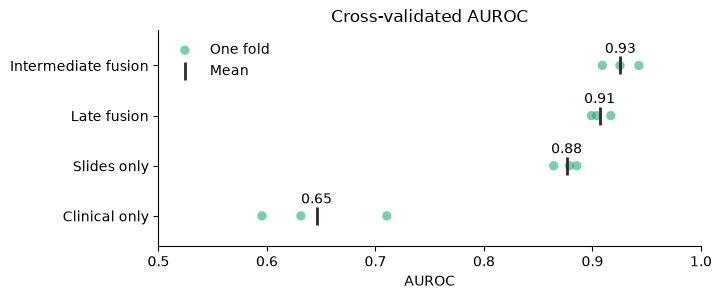
Given a baseline, bootstrap_ci scores both models on the same resampled patients, so the interval is of the gain itself.
clinical_pipeline = clone(pipeline).set_params(model=clinical_model, **fixed_training).fit(train)
clinical_predictions = clinical_pipeline.predict(test)

gain = bootstrap_ci(
    auroc, predictions, test.target.frame.loc[predictions.index], context,
    baseline=clinical_predictions.loc[predictions.index]
)
print(f'AUROC gained by adding slides to the clinical table: {gain.estimate:+.2f} (95% CI {gain.lower:+.2f} to {gain.upper:+.2f})')
AUROC gained by adding slides to the clinical table: +0.32 (95% CI +0.17 to +0.48)
6 Interpretting the results
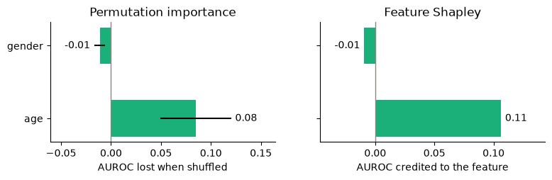
The cohort synthesised with these signals: slides carry the most signal, age adds some, and gender adds none.
Can the interpretation tools recover them?
6.1 Which modality matters?
These tools mark a modality as absent and measure what the model loses. Each modality is scored on the same patients, so the patients with no slide are left out.
from kalecancer.interpret import leave_one_out_ablation, modality_shapley

shapley = modality_shapley(pipeline, test, auroc)
ablation = leave_one_out_ablation(pipeline, test, auroc)

print(f"Scored on {len(test) - shapley.attrs['n_excluded']} patients")
pd.DataFrame({'Shapley value': shapley, 'AUROC lost when removed': ablation}).round(3)
Scored on 44 patients
| Shapley value | AUROC lost when removed | |
|---|---|---|
| clinical | 0.062 | 0.062 |
| slides | 0.268 | 0.268 |
Note: with two modalities, both Shapley and abalation match. With three or more, Shapley also splits the credit fairly between modalities that overlap.
6.2 Which clinical features matter?
from kalecancer.interpret import feature_shapley, permutation_importance

importance = permutation_importance(pipeline, test, auroc, n_repeats=20, seed=RANDOM_STATE)
feature_values = feature_shapley(pipeline, test, auroc, n_samples=30, seed=RANDOM_STATE)

fig, (left, right) = plt.subplots(1, 2, figsize=(9, 2.2), sharey=True)
left.barh(importance.index, importance['mean'], xerr=importance['std'], color=MODEL, height=0.5)
left.set(title='Permutation importance', xlabel='AUROC lost when shuffled')
right.barh(feature_values.index, feature_values, color=MODEL, height=0.5)
right.set(title='Feature Shapley', xlabel='AUROC credited to the feature')
for ax in (left, right):
    ax.bar_label(ax.containers[-1], fmt='%.2f', padding=4)
    ax.axvline(0, color='#8a8880', linewidth=1)
    ax.margins(x=0.32)
plt.show()
6.3 Where on the slide?
attention shows us how much weight the model gave every patch, and attention_heatmap helps us visualise these values.
Our synthetic data records which patches are truly aggressive, so we can compare the two.
import h5py
from kalecancer.interpret import attention, attention_heatmap, save_heatmap

weights = attention(pipeline, test, 'slides')

def read_aggressive(path):
    with h5py.File(path) as f:
        return f['aggressive'][:]

weights['aggressive'] = np.concatenate([read_aggressive(path) for path in weights['file'].unique()])
weights.drop(columns='file').head()
| patient_id | x | y | attention | aggressive | |
|---|---|---|---|---|---|
| 0 | patient_000 | 0 | 1280 | 0.014410 | False |
| 1 | patient_000 | 0 | 1536 | 0.005025 | False |
| 2 | patient_000 | 0 | 1792 | 0.002580 | False |
| 3 | patient_000 | 0 | 2048 | 0.003249 | False |
| 4 | patient_000 | 0 | 2304 | 0.001864 | False |
def heatmap(patient, column):
    rows = weights[weights['patient_id'] == patient]
    return attention_heatmap(rows, patch_size=PATCH_SIZE, downsample=2 * PATCH_SIZE, weight_column=column)

patients = predictions.loc[test.present_ids('slides'), 'probability[late]'].nlargest(3).index

fig, axes = plt.subplots(2, 3, figsize=(9, 6))
for column, patient in enumerate(patients):
    axes[0, column].imshow(heatmap(patient, 'aggressive'), cmap='Oranges', vmin=-0.15)
    axes[0, column].set_title(patient)
    axes[1, column].imshow(heatmap(patient, 'attention'), cmap='Oranges', vmin=-0.15)
for ax in axes.flat:
    ax.set(xticks=[], yticks=[])
    ax.spines[:].set_visible(False)
axes[0, 0].set_ylabel('Truly aggressive')
axes[1, 0].set_ylabel('Model attention')
plt.tight_layout()
plt.show()
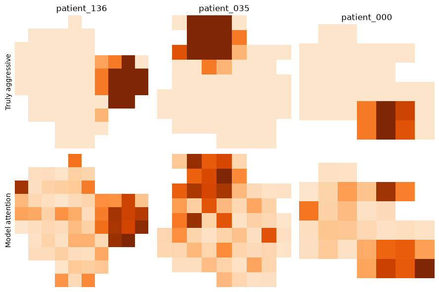
Those three are the model’s most confident late-stage patients, so here is the check across every test slide: for each one, are the patches it attends to most actually aggressive?
def hit_rate(rows):
    return rows.nlargest(rows['aggressive'].sum(), 'attention')['aggressive'].mean()

with_region = weights.groupby('patient_id').filter(lambda rows: rows['aggressive'].any())
hits = with_region.groupby('patient_id')[['attention', 'aggressive']].apply(hit_rate)
chance = with_region.groupby('patient_id')['aggressive'].mean()

print(f'Most-attended patches that are truly aggressive: {hits.mean():.0%} (chance: {chance.mean():.0%}, {len(hits)} slides)')
Most-attended patches that are truly aggressive: 42% (chance: 10%, 44 slides)
Save the results to review them outside Python: a PNG for each heatmap, and a table of weights and coordinates.
save_heatmap(heatmap(patients[0], 'attention'), data_folder + f'/heatmaps/{patients[0]}.png', colormap='Oranges')
weights.to_csv(data_folder + '/heatmaps/attention.csv', index=False)
6.4 What has it learned?
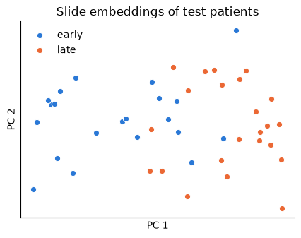
encode gives you the embedding of any modality, ready for your own analysis.
from sklearn.decomposition import PCA

embeddings = pipeline.encode(test, 'slides')
projection = PCA(n_components=2).fit_transform(embeddings)
stages = test.target.frame.loc[embeddings.index, 'label'].to_numpy()

fig, ax = plt.subplots(figsize=(5, 3.6))
for stage, colour in [('early', EARLY), ('late', LATE)]:
    ax.scatter(*projection[stages == stage].T, s=36, color=colour, edgecolor='white', linewidth=0.8, label=stage)
ax.set(title='Slide embeddings of test patients', xlabel='PC 1', ylabel='PC 2', xticks=[], yticks=[])
ax.legend(frameon=False)
plt.show()
KaleCancer Workflow
You want to |
Use |
|---|---|
Join a table and slides by patient |
|
Prepare data |
|
Try different models |
|
Get confident estimates |
|
Explain modalities and features |
|
Interpret slides |
|
Share the experiment |
|
There is more beyond this notebook:
Survival outcomes:
CoxHead,kaplan_meier,calibration_tableandpatient_report.Real slides:
overlay_on_slidedraws a heatmap on the slide image.Larger clinical tables:
TabICLEncoderis a pretrained tabular encoder.
To use your own data, point section 1 at your files, then match the encoder sizes in section 2 and the column names in section 3. The rest of the workflow stays the same.